|
|
Post by Sigurdur on Aug 15, 2022 15:04:16 GMT
|
|
|
|
Post by missouriboy on Aug 22, 2022 16:16:46 GMT
Net Oceanic/Global Heat Loss During La Nina I have been seeing this same general pattern for weeks and weeks now. Colder than normal La Nina surface waters progressing westward across the equator as measured by SSTAs ... and warmer than normal surface waters moving poleward around the north and south Pacific gyres (Chart 1). And daily changes in these SSTAs (Chart 2). Colder than normal patches in chart 2 would (I assume) reflect both the spatial movement of warmer and cooler surface water patches geographically and losses in surface heat content due to evaporation ... specifically in the poleward-moving North and South Pacific plumes. This is simplistic, but I interpret the overall pattern as huge heat exchanges from ocean to atmosphere over the North and South Pacific Oceans ... also the Atlantic. This should result in a net cooling of the oceans ... and thus, the land masses as well. A realignment of the Earth's heat balance to lower solar radiation input conditions. A very quick search did not yield any papers on this topic. I assume that a long digital times-series of these data exist (no data guy/gal throws such a data set away). Again, this is simplistic. Comments?
Since these charts are live links, they will change daily. 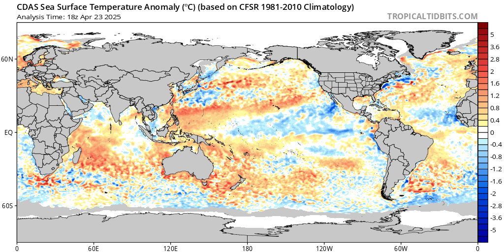 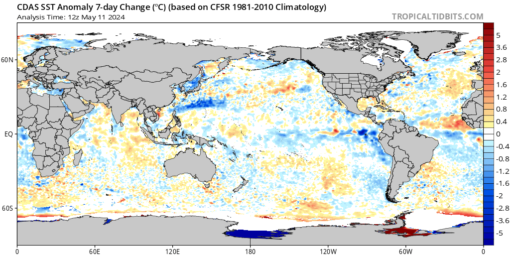 |
|
|
|
Post by ratty on Aug 22, 2022 22:19:03 GMT
Missouri, I can't think of a reason to disagree.
|
|
|
|
Post by Sigurdur on Aug 23, 2022 2:08:22 GMT
Agree 100% with your analysis.
|
|
|
|
Post by nonentropic on Aug 23, 2022 3:35:38 GMT
|
|
|
|
Post by missouriboy on Aug 23, 2022 3:52:09 GMT
|
|
|
|
Post by nonentropic on Aug 23, 2022 9:51:09 GMT
We are well and enjoying what passes as a ski season in NZ. the next if the world will allow will be next year at Sun valley Idaho my all-time favorite.
The skiing in NZ is agricultural. Ice and hard pack are viewed as character-building. At 67 I'm fully built. Just saying!!
|
|
|
|
Post by ratty on Aug 23, 2022 10:26:24 GMT
We are well and enjoying what passes as a ski season in NZ. the next if the world will allow will be next year at Sun valley Idaho my all-time favorite. The skiing in NZ is agricultural. Ice and hard pack are viewed as character-building. At 67 I'm fully built. Just saying!! Snow is probably falling down South atm .... book a flight.  |
|
|
|
Post by nonentropic on Aug 23, 2022 19:19:06 GMT
Ratty given the way the atmosphere works will allow NZ second use of your southerly fronts. In fact I am looking forward to a day of relaxation as it snows up there at this moment.
|
|
|
|
Post by duwayne on Aug 24, 2022 16:26:59 GMT
Net Oceanic/Global Heat Loss During La Nina I have been seeing this same general pattern for weeks and weeks now. Colder than normal La Nina surface waters progressing westward across the equator as measured by SSTAs ... and warmer than normal surface waters moving poleward around the north and south Pacific gyres (Chart 1). And daily changes in these SSTAs (Chart 2). Colder than normal patches in chart 2 would (I assume) reflect both the spatial movement of warmer and cooler surface water patches geographically and losses in surface heat content due to evaporation ... specifically in the poleward-moving North and South Pacific plumes. This is simplistic, but I interpret the overall pattern as huge heat exchanges from ocean to atmosphere over the North and South Pacific Oceans ... also the Atlantic. This should result in a net cooling of the oceans ... and thus, the land masses as well. A realignment of the Earth's heat balance to lower solar radiation input conditions. A very quick search did not yield any papers on this topic. I assume that a long digital times-series of these data exist (no data guy/gal throws such a data set away). Again, this is simplistic. Comments?
Since these charts are live links, they will change daily.   If you imagine a large circle of surface water which extends from the equator in the Pacific down to somewhere north of Antarctica and somehow rotate it 180 degrees and then look at the ocean surface anomalies, obviously there would be a lot of blue near the equator and a lot of red in the southern Pacific.
But the average ocean temperature in this circle area would be exactly the same since it’s the identical surface water, just in different locations. The entire global ocean temperature average would be unchanged and the overall global average temperature would be unchanged by that event. To the extent that something like the Humboldt current moves surface water around, that surface relocation doesn’t affect average global temperatures much regardless of the color changes on the anomaly chart.
On the other hand, if cool water is moved from below the ocean surface and spread onto the surface, the surface cools and this does affect average surface temperatures. That’s what ENSO does. The longer ENSO lasts, the more cool water is poured onto the surface and the more earth’s surface temperature cools.
Once ENSO ends, it’s not clear to me that future surface water redistributions will change global temperatures even if there is currently a lot of blue on the anomaly chart in certain locations. |
|
|
|
Post by missouriboy on Aug 24, 2022 19:45:32 GMT
Net Oceanic/Global Heat Loss During La Nina I have been seeing this same general pattern for weeks and weeks now. Colder than normal La Nina surface waters progressing westward across the equator as measured by SSTAs ... and warmer than normal surface waters moving poleward around the north and south Pacific gyres (Chart 1). And daily changes in these SSTAs (Chart 2). Colder than normal patches in chart 2 would (I assume) reflect both the spatial movement of warmer and cooler surface water patches geographically and losses in surface heat content due to evaporation ... specifically in the poleward-moving North and South Pacific plumes. This is simplistic, but I interpret the overall pattern as huge heat exchanges from ocean to atmosphere over the North and South Pacific Oceans ... also the Atlantic. This should result in a net cooling of the oceans ... and thus, the land masses as well. A realignment of the Earth's heat balance to lower solar radiation input conditions. A very quick search did not yield any papers on this topic. I assume that a long digital times-series of these data exist (no data guy/gal throws such a data set away). Again, this is simplistic. Comments?
Since these charts are live links, they will change daily.   If you imagine a large circle of surface water which extends from the equator in the Pacific down to somewhere north of Antarctica and somehow rotate it 180 degrees and then look at the ocean surface anomalies, obviously there would be a lot of blue near the equator and a lot of red in the southern Pacific.
But the average ocean temperature in this circle area would be exactly the same since it’s the identical surface water, just in different locations. The entire global ocean temperature average would be unchanged and the overall global average temperature would be unchanged by that event. To the extent that something like the Humboldt current moves surface water around, that surface relocation doesn’t affect average global temperatures much regardless of the color changes on the anomaly chart. On the other hand, if cool water is moved from below the ocean surface and spread onto the surface, the surface cools and this does affect average surface temperatures. That’s what ENSO does. The longer ENSO lasts, the more cool water is poured onto the surface and the more earth’s surface temperature cools. Once ENSO ends, it’s not clear to me that future surface water redistributions will change global temperatures even if there is currently a lot of blue on the anomaly chart in certain locations. If you subscribe to the theory that solar radiation is the dominant driver of global upper ocean temperatures, with the greatest zones of accumulation being the “relatively” cloudless portions of the tropical and sub-tropical oceans, then any changes to solar inputs (particularly in the extreme UV portion of the spectrum) should affect the “net” heat content of the upper oceans (ceteris paribus). ENSO and the great ocean gyres merely move water (and heat) around. ENSO (under El Nino conditions) returns warmer waters from the Pacific Warm Pool to the Eastern Pacific Ocean. The western North and South Pacific gyres move water poleward from the Western Warm Pool. They are generally stronger during El Nino conditions. Seasonal Trade Wind strength moves surface tropical waters back to the west, both after El Ninos and in between. Meanwhile, evaporation tries to equalize the heat gradient between the oceans and the troposphere. Just as surfacing El Nino gravity waves release vast quantities of heat (as water vapor) into the relatively dry and less cloudy lower troposphere of the East Tropical Pacific, so too do the warm ocean gyres of the North and South Pacific (and Atlantic). We see from UAH, how closely LT temperature anomalies over the tropical oceans follow ENSO. I agree with your sentence one in paragraph 3. The coldest water in Nino Region 1+2 occurs every year from mid-summer to late fall. Strong El Ninos override the cold values. And the coldest values are concentrated in La Ninas during and following weaker solar cycles. This infusion of colder waters do change the equation. I don’t doubt that much(?) of this is upwelling. And I do expect net cooling associated with these infusions. I would argue that there are net positive and negative changes in the heat content of the upper ocean layers under strong and weak solar cycles. These are modified over time as solar conditions change.
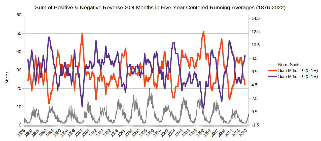
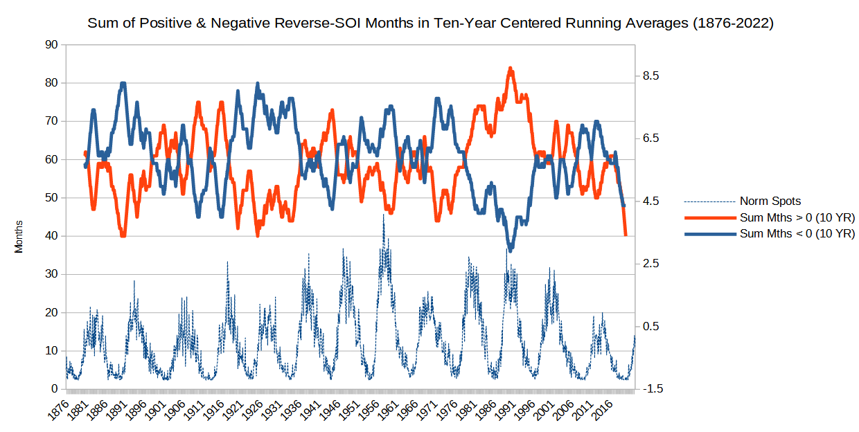
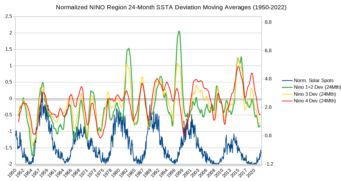 The following two charts are 5-year and 10-year centered moving tallies of positive and negative Reverse-SOI months, used as a proxy for ENSO back to 1876.
  |
|
|
|
Post by ratty on Aug 24, 2022 21:39:25 GMT
I wonder what would an 'intersection' line would look like if you averaged the red and blue values in the bottom two graphs?
|
|
|
|
Post by missouriboy on Aug 24, 2022 22:42:13 GMT
I wonder what would an 'intersection' line would look like if you averaged the red and blue values in the bottom two graphs? It would look more or less like this. 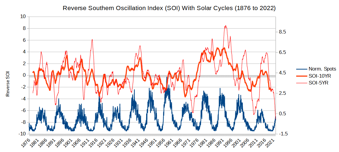 |
|
|
|
Post by duwayne on Aug 25, 2022 12:09:17 GMT
I wonder what would an 'intersection' line would look like if you averaged the red and blue values in the bottom two graphs? It would look more or less like this.  What is the R-squared value for the correlation? |
|
|
|
Post by Sigurdur on Sept 4, 2022 17:16:32 GMT
|
|